DISCLAIMER: A large portion of the assets/images shown on this blog entry DO NOT belong to me, they are used for educational/entertainment purposes only. I do not plan to sell the finished product (please don’t sue me)
Hello again, everyone. Hope you have an exciting week.
So…
WHAT’S BEEN GOING ON WITH THE PLATFORMER PROJECT?
Before I look for the appropriate assets, I was instructed by one of my Game Design lecturers to convey my design intention via blocks or silhouettes first.
The idea is, my overall design should be solid on its’ own, once that is accomplished, the art assets will definitely give the game more life.
Build the design from the ground up, bit by bit.
QUESTION – WHAT DO YOU SEE?

Based on this visual mock-up, can you tell me:
- who is the player character?
- what can you tell about his appearance?
- who is the enemy character?
- what can you tell about their appearance?
- what is the objective?
- are you able to identify where you need to go?
MY DESIGN INTENTION

This is my player character, he is meant to look “weak” by having a thin build compared to the enemy character.
To emphasise his “weakness” and requirement to outrun his enemies. He can be seen to be on a “hover-board” in the air.

This is the enemy character the player would be facing, in comparison to the player, they are shorter, but more bulky and can be visually be seen holding a weapon. The enemies are grounded (and not the player) and look like tanks, slow but sturdy and dangerous.

The key will be a positive element, so like the player, it can be seen hovering.

Lastly, here’s the door, about the same shape as the player, organic, but much larger, for players to identify the means of escape.
Unlike the player and the key, it is grounded.
(because a floating door makes no bloody sense)
Lastly, as for what do you need to do to complete the level.

WHAT RESEARCH DID YOU DO IN ORDER TO CREATE THAT?
I managed to find some really nifty blog entries on the importance of proper planning (assets and level design wise) and uses a silhouette can have on a game:
Gamasutra: Ration Design – The Core of Rayman Origins (blog)
Gamasutra: How to Make Insane, Procedural Platformer Levels (blog)
Blogger: Character and Creature Design Notes (blog)


“While these objects do not share a similar colour palette to indicate their inherent danger, the silhouette alone serves as a clear enough sign for universal understanding. By combining a strong silhouette with colour and scaling, a gameplay element can be extremely apparent, readable and clear almost immediately.”
Chris McEntee, designer at Ubisoft Montpelier
Rayman Origins and Legends were extremely well-received games, key contribution to the enjoyment of both games (my opinion) was the fact that it was quick-paced, engaging and each death was not punishing to the player.
(death was frustrating, but not enough to kill player experience)
This is due to each asset having a very clear view to the player on what is positive and what is negative to them, let’s use the image above and analyse them:

Here, you can see the assets are mostly organic shapes, they are not sharp so visually, they do not look dangerous to approach/interact with.
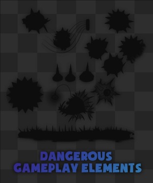
As compared to above, the shapes are basically the same, but the developers added spikes on their already existing assets. This change allows players to identify the difference between the positive and negative assets.
Below is an example of how quick-paced the game can get, and the end result of the careful design decisions that made players able to identify the threats quickly, making them feel good when they successfully navigate through the level.
Both videos were obtained from Ubisoft‘s official Youtube page.
A bonus video on Silhouette by a Disney animator veteran, Aaron Blaise, obtained his Youtube page.
CONCLUSION FROM MY RESEARCH
Silhouette (and proper planning) plays the important element in level design and gameplay because, if designed well:
- it provides the player clear (immediate) information on what is harmful for them in mere seconds, without the need of text spamming the screen
- development cycle-wise, you can re-use art assets and save time greatly, not to mention not waste resources (or create unnecessary tension within the work place)
- less feature and an abundance of assets will allow the time needed to fine-tune elements that is necessary
Until the next update, have an exciting week.
This blog was edited on: June 29th 2016, 5:25 PM.
