DISCLAIMER: A large portion of the assets/images shown on this blog entry DO NOT belong to me, they are used for educational/entertainment purposes only. I do not plan to sell the finished product (please don’t sue me)
Hello, hello.
Hope you have an exciting week.
After receiving some feedback on my visual “silhouette” mock-up, I am glad to say that generally, people understood what is going on with my level.
SO!
I can move on to the next phrase of the my development: Colour Study.
WHY? YOU’RE NOT AN ARTIST
If my design is solid, I can re-use the assets I have, as opposed to, creating new ones for each level over and over again, wasting time.
Not to mention, if I know my design intention is solid, I can confidently tell the artist what works and what DOES NOT work for the project, with valid existing data.

COLOUR STUDY, WHAT’S THE BIG DEAL?
Colours are used in our daily lives yet we don’t really see the point as long as it’s “pretty”.
If planned properly, development time can be saved a great deal. You can buy a great cup of coffee, but you can’t buy lost time.
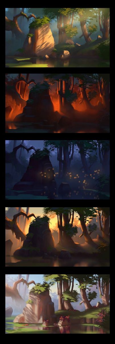
Below is the same image, but because it was coloured differently, you can show a different vibe/mood without needing to create a new image altogether.
“The primary function of colour vision is to make it easier to identify objects, and indeed, the use of colour in games reflect this. We make apples red in games because they are also red in the real world, and so we can recognise them easier in the game.”
Herman Tulleken and Jonathan Bailey, Co-Founders of GameLogic
Based on the statement above, let’s try to run a small social experiment.
Look below, how many do you recognise? And how long did it take you to even process the thought?

By combining an easily identifiable shape (silhouette) mixed with precise colours, you can make a timeless symbol.
Now, let’s try to shift this perspective for games.
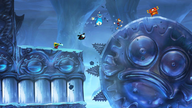
As mentioned from my previous blog, Rayman Origins is an excellent game. Fun, and full of good design choices.
Look below, there is little variety of colours, but it is easy to see what is going on without the need of text explaining the situation.
Below are articles that helped with my understanding on the importance of colours, and what possible role it can lead to, I STRONGLY recommend you guys check them out when you can, it’s a real mind-opening read.
Shutterstock : Movie Magic, 4 Ways Colour Can Transform Your Work
Colour : Why is Colour Choice so important in Design?
VISUAL MOCK-UP EXPERIMENT
So based on the research I’ve done, I went back to my original Illustrator file and tweaked the colours to see what best suits for easy identification in-game, but use as limited colours as possible.
Design Intention: For my players to feel trapped inside of an alien place, alone.
THIS IS AN EXPERIMENT, IT DOES NOT REPRESENT THE FINAL PRODUCT OF THE GAME. ALL IMAGE BELOW WERE CREATED BY ME IN ADOBE ILLUSTRATOR


SUMMARY OF THE RESEARCH AT HAND
Colours in games are important due to:
- allows us to re-use assets (save time, avoid feature creeping)
- portray mood to the player, immerse them into your world (game/movie)
- give a sense of progression for the audience (cold > warm, for example)
- easy and quick identification for audience on items of importance, enemies, and objective
Until the next update, have an exciting week.
BONUS MATERIAL
By the way, one of my Game Design lecturer shared this really nifty blog from Unity, it’s a detailed breakdown on how a short film was created.
It will also serve as a solid reference (for me mostly) on how to record and show the public on what processes were brought up in the concept and development phrase.
ADAM – Production Design for the Real-Time Short Film
This blog was last edited on: July 13th 2016, 5:10 PM.
