DISCLAIMER: A large portion of the assets/images shown on this blog entry DO NOT belong to me, they are used for educational/entertainment purposes only. I do not plan to sell the finished product (please don’t sue me)
Hello hello, everyone.
Silhouette design, solid.
Colour study, solid.
Now, it’s time to put the details in but first, a quick recap, what am I aiming for?
“I want to create a solid level, where players would feel that they have been isolated from the safety of human society, trapped inside a sinister alien vessel and they just want to get the heck out, albeit cautiously.”
Keywords: Alien vessel, Isolation, Sinister, Caution and Trapped.
So, I’ve browsed around the internet, and found some games that may help in the direction I am trying to achieve.

Also, before we move on, I’m cancelling the Door and Key feature of the game, due to time restraints so I made an “exit portal” instead in the form of the TARDIS.
RESEARCH MATERIAL
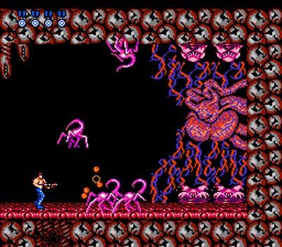
First thing that popped into my mind is Contra, the game’s final boss background intrigued me. It looks orderly but at the same time, it is chaotic. Visually, it looks like the inside of a human body.
Notice the background (here) is black, and the threat is usually coloured in red with a mixture of white, just depends which shade overpowers the other. Also, the enemy colours and shapes are easily identifiable to the player. (creepy shapes like spiders, blood veins and a heart)
As for the player character, the idea of controlling a shirtless man in just his pants is not just playing a “Rambo” stereotype, it is designed that way so players can also see where their avatar are, midst the chaos.

The image above is from an old Italian horror film, notice the walls are clean but the floor tile makes people feel uneasy due to its’ design (it’s disorientating). It almost looks like a spider’s web, which is a common phobia to many people (arachnophobia).
VISUAL MOCKUP
After going through what data I could look for, I created this visual mockup.

I used these two images (below) and slapped them together in Photoshop and tweaked about until I got the right shade of blue. Just dark enough for people to see visually and able to tell where is their avatar and where are the enemies.


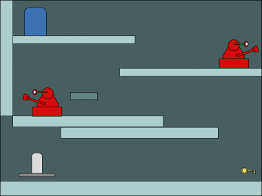
In my previous entry, I experimented with three different shades of colour and found this to be the one with the most contrast.
You CAN see the Doctor, the Wall, the Daleks and different types of tiles layered all over the place. That’s what I want.
Alright, after this entry I will be making a playable prototype of my idea in my next post. Which includes adding audio files, making sure the game build itself is playable and has a complete loop. (start > finish > start)
Until then, have an exciting week.
This blog entry was last edited on : July 27th 2016, 2:45 PM.
